Hello everyone and happy Sunday! As promised, this is going to be my first post in my “gimmick” series – now more descriptively called “Is it a Gimmick?”. Rather than go into my collection and pull out items that have already been released and reviewed, I wanted to review something brand new for this post, and something that I’ve seen heavily marketed all over instagram for weeks before it’s actual, official release last week: the limited edition Pirates of the Caribbean collection from Lorac Cosmetics.
This collection includes an eyeshadow palette ($52), cheek palette ($30), and six lipstick + lip gloss duos ($26). I personally got the two palettes, and was originally going to get a lippie to also review, but just could not justify the price of the lippies (more later) and did not end up buying any and therefore cannot speak about them, only the palettes.
In this post I am going to be reviewing everything from the packaging, quality, pricing etc., and finish with whether or not I think this collection is gimmicky, and more importantly do I think it is worth it for you to buy.
You can purchase this collection from Lorac Cosmetics, Ulta Beauty, and Kohl’s. It might come to QVC since they normally sell Lorac products, but I can’t find the collection currently on their website. Also, you can get cash back if you shop with Ebates on Ulta (3%) or Kohl’s (6%) (which is what I did), and if you are an Ulta rewards member you can obviously apply any past points you have earned towards the purchase.
Anyway, let’s get into it! This is going to be a long one, so get comfy ❤︎
Packaging:

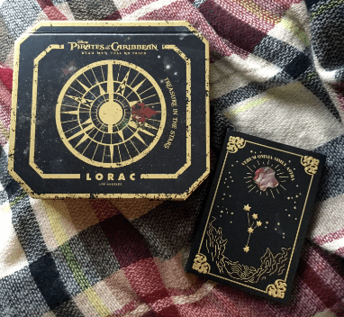
When I first saw images of this collection online, I thought it looked a little silly, kind of like how kid’s play makeup looks in it’s big, bulky, cutesy packaging. However, after receiving this collection I have completely changed my mind (let’s be honest, it completely appeals to my spooky aesthetic).
There are a lot of subtle details in this packaging that make it extremely beautiful and makes it feel worth the price. While the packaging is made of cardboard, it still feels very heavy and very sturdy. There are nice magnetic closures on both palettes plus big mirrors, so I think you could travel with them easily (at least with the cheek palette anyway).
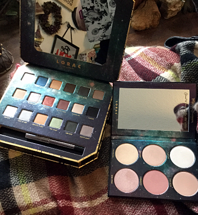
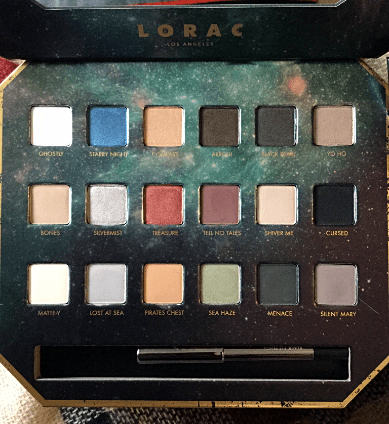
There is a LOT of detail in every inch of these palettes: there is reflective, metallic gold detailing all over the outside, quotes on the mirrors, and a gorgeous metallic galaxy print along the insides of the palette. The names of the individual shadows and cheek products are printed inside the palettes in gold as well.

Another super cool thing about this packaging is the larger eyeshadow palette has a “secret compartment” to keep the cheek palette in – friggen adorable. However, I felt like through the marketing of this collection, this little pairing was shown together so much that I was led to believe that these items would be sold together when they are actually sold separately: so obviously this is a little gimmick to get you to buy both together and to spend more money.
The eye palette also comes with a mini eyeliner, but to be honest I much would have preferred if it came with a brush instead (though a brush is included if you buy specifically from the Lorac website). The eyeliner is nice quality though, not the creamiest pencil liner ever – but very black and stays put once you apply it. The product description claims this is to help achieve a Captain Jack Sparrow inspired eye (lol).

One final thing is the size of the eyeshadow palette: it is gigantic. I am showing it here with another Disney/Makeup collab, the Alice Through The Looking Glass palette by Urban Decay (sadly no longer available), because they are the same exact size (height and width), and if you are familiar with the Alice palette you’ll know it’s pretty damn big and hard to store (I honestly don’t know where I am going to keep my Pirates palette). The cheek palette in contrast, though, is nice and slim and appropriately sized, so if you don’t plan on storing it within the eyeshadow palette you could easily keep it in your makeup bag, on your vanity, or in a drawer.
Overall, if you are really into Pirates of the Caribbean, Disney, or anything pirate/nautical related I think you would love this packaging and want to display it because it is so pretty.
Quality + Swatches:

One of the reasons I personally wanted this collection was because I really love Lorac’s formulas. The eyeshadow formulas are advertised as the same “Pro” formulas which you would find in any of their other Pro palettes, and the blush and highlighter formulas are advertised as the same as their standard “Color Source” blushes and “Light Source” highlighters.

Lorac pro eyeshadows are EXTREMELY pigmented and buttery. This can be both a good and bad thing though: on the one hand it’s good because a very little shadow will go a very long way (making the palette a nice investment), and because they are so creamy they are very easy to blend. The bad thing, though, is that because they are so creamy you barely need to dip your brush into the product, or else there is going to be a ton of kick-up. Also, if you are a real beginner to makeup and eye makeup specifically, I would be hesitant to recommend this formula to you only because their extreme blendability makes it easy for shadows to get muddied together if you do not have complete control with your brushes or technique. (sometimes you get better control and easier, more specific placement with a stiffer formula).
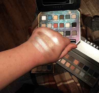
These shadows are true to the pro formula. Every shade is creamy and smooth, the mattes are just as buttery as the metallics (which are blinding) with no skipping, and color can be built up beautifully. The only shadow that I feel gives some trouble is “Menace”, the deep charcoal gray near the end, as it swatches just a little patchy, but nothing that a little extra blending with a brush couldn’t fix. Honestly, though, I like this color scheme – when paired all together like the swatches above it really does look “piratey”.
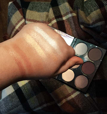
If you’ve read my Best of Beauty 2016 post you’ll know I raved about the Light Source highlighters from Lorac, and even though this collection claims to be the same formula, I actually feel like I like these highlighters a lot better. The original Light Source highlighters are more subtle and “glow-from-within” like, but the highlighters in this cheek palette are (dare I say) blinding and much more metallic. The “pirates” formula feels much smoother and less powdery and stiff than the original “light source” formula despite claims that they are no different.
The same goes for the blush and contour shade in this cheek palette: compared to other Lorac “color source” blushes they are far less powdering and much more smooth, and I would compare them more closely to the Lorac Pro Contour Palette (which is a personal favorite of mine). Again, just like the eyeshadows, this is another formula that you need a super light hand with or else you will get a ton of kick-up. Definitely tap off your brush before applying to the face (a little goes such a long way).
I do want to also note that while the highlighters as well as the blush could be good for a range of skin tones, I feel like the contour shade will most likely only work if you have a fairer complexion.
Overall Value and Originality:
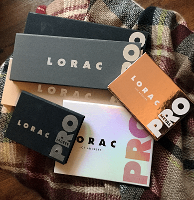
When compared to the other Pro palettes that I’ve mentioned above, the eyeshadow pans are the exact same size as the pans you get in the Lorac Pro 1, 2, & 3 Palettes (0.02 oz/0.55 g each, and a total of 0.36 oz/12.6 g for a whole palette of 18 shadows). This is slightly less per pan than what you get in the Beauties Who Brunch palette (0.03 oz/0.89 g each), and slightly more than what you get in the Pro Metal and Pro Matte palettes (0.018 oz/0.5 g each).
Cost break down is a little tricky here given the varying pan sizes per pro series, and the fact that you get an added eye primer with the Pro 1, 2, & 3 palettes, but with the Brunch palette you get 2 additional shadows, eye primer, and a double-sides eye brush for the same price ($44), not to mention with the Pirates palette you get a mini Front of the Line Pro Eye Pencil in black (0.007 oz/0.2 g mini versus 0.012 oz/0.34 g in a full size) and (arguably) nifty packaging (though if you purchase off the Lorac website you also get a brush as well).
To make it simple I am just going to compare it to the Pro 1, 2, & 3 palettes and ignore all the added stuff: In the original Pro palettes you are paying $2.75 per shadow ($44 dollar palette / 16 pans = $2.75 each), and in the Pirates palette you are paying about $2.89 per shadow ($52 dollar palette / 18 pans = $2.89 each). So while you are paying $0.14 more a shadow in the Pirates palette, you could possibly justify it with the eyeliner, brush (if you order from the Lorac website), and shiny packaging if that is worth more to you than a mini eye primer.
In the cheek palette, you are getting a total of 0.54 oz/15.42 g (0.09 oz/2.57 g each), which is a little more than half as much as an original Lorac Color Source blush (0.14 oz/4 g) and less than half of the Light Source highlighters (0.2 oz/5.82 g).
Both Lorac’s blushes and highlighters go for $23 dollars individually, and in this palette you are roughly paying $5 dollars per shade ($30 dollars / 6 pans = $5 dollars for what is roughly an $11.50 (give or take) value) – I would say this makes the cheek palette extremely worth the price, especially for the quality.

What was most important to me (as an eyeshadow junkie) when buying the eyeshadow palette was originality in it’s color selection, especially since I own other Lorac Pro palettes. The three shadows that really drew my attention when purchasing this palette where the metallic blue, red, green, and silver shades, which honestly looked very similar to not only some shades in the Pro 1, 2, & 3 palettes, but especially to a lot of the shades in Pro Metal palette.

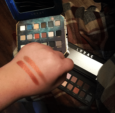
Here are some swatches comparing the red shade, “Treasure”, from the Pirates palette to the shade “Garnet” in the Pro 1 palette: Treasure is a much more true red, while Garnet is much more orangey/brown. I would say they are pretty different.

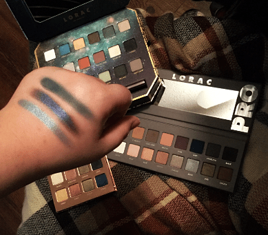
In the pans, the blue shade “Starry Night” looks very similar to the shade “Cobalt” in the Metal palette, and could even be compared to the matte blue shade “Navy” in the Pro 2 palette, but again there are obvious differences: Starry Night is a true sky blue, Cobalt is a much deeper, purple blue, and Navy is (as the name suggests) a true navy.

Comparing “Sea Haze” from the Pirates palette to “Clover” in the Metal palette and “Jade” in the Pro 2 palette, Sea Haze looks more like a lighter, mossy green, while Clover is more olive toned, and Jade is a deep antique brassy green.
Finally, looking at all the silver shades I could find in all the pro palettes: “Silver Mist” in the Pirates palette is the most similar to “Silver” in the Pro 2 palette, however Silver Mist has a pinkish undertone while Silver is a very true silver. Also comparing it to both “Graphite” and “Quartz” in the Metal palette, Graphite is a much deeper gray, and Quartz is much lighter white shade.
If you like these shadows but are not really a stickler for different undertones or any of that jazz, you might be better off saving the money and grabbing the Pro Metal palette, but you won’t get a full eye look with that palette as it is all metallic shadows. If you want a mixture of both matte and metal and want to save some money, maybe try the Pro 1 or 2 palette if you like these colors schemes.
If you’re an eyeshadow junkie like me, though, and like these tone differences and think you could get a lot of looks out of them: then I would say go for it (if you honestly have nothing else like it in your collection and can afford it).

I didn’t bother comparing any of the matte shadows because I feel like matte browns and blacks etc. are basically going to look the same in every palette from every brand ever, but I do personally think they are needed to make a complete palette and a full eye look.


One thing I also wanted to touch on was this duochrome blue/red shadow that is in the Pirates palette: a LOT of brands have similar shadows, and here are just some swatch comparisons from Too Faced, Makeup Geek, Tarte, and Wet n Wild (but there are tons more beyond that).

Something that bothers me about this palette is the similarity of colors within the palette itself. For instances, “Ghostly” (matte white) and “Matte-y” (matte cream) look extremely similar when swatched together. Same goes for “Silvermist” (metallic silver) and “Shiver Me” (metallic white) (not swatched, but “Yo Ho” is also yet another silver metallic). Also, the shade “Menace” is a is a dark matte gray, and “Curse” is a matte black with shimmer – but again that glitter is going to be lost when applying and the colors end up looking basically the same. Finally, the two light brown shades in the palette, “Bones” (a more taupe brown) and “Pirates Chest” (a more orange brown) also look pretty dang similar. I personally would have loved if some of these similar shades could have been replaced with more colorful, jewel-toned shadows to give more variety and add to the pirate/treasure kind of feel the palette is trying to have. The palette does have some golds (“Compass” and “Yo Ho”) but some more true yellow golds, or even some old-looking bronze golds could have added more to the theme as well. A beautiful metallic purple would have gone really well with this color scheme, too.
Overall – do I think this is a groundbreakingly original palette? No. Do I think it is a good palette and you could get a variety of looks from it? Yes – and honestly while it might not be the standout, bright and colorful palette of your dreams, it feels way more like an every day kind of palette to me, and you could easily create lots of looks for going to work or school as well as an occasional bright or dramatic smokey eye. I think for the average makeup wearer, this would be a good, well rounded palette, but if you are like me and own a ton of neutral, every day type of palettes, it is probably not going to be much different than everything else you have.
Conclusions: Is It A Gimmick?
As I’ve mentioned, the quality of this collection is really great. When it comes down to the price, I feel like the cheek palette is definitely worth it, while the eyeshadow is honestly not that original beyond the packaging, and probably totally not worth it unless you are a palette collector or really, really love Disney and Pirates of the Caribbean. The little hidden compartment to keep the cheek palette in is cute and original, but the fact that the two items are not included together make it especially gimmicky to me.

Pirates of the Caribbean Mod Lip Cream Duo
At $26 dollars, the lipstick/gloss duos were not worth it to me to even buy one of, and besides one blue shade, they were not original in color at all, and the dual ended thing just seemed really gimmicky and silly.
If you were going to buy any one item from this collection, I would definitely suggest it be the cheek palette as it was the best value, the easiest to store, and extremely good quality. However, as I said, I don’t think the contour shade will work for deeper skin tones, which is a real bummer.
Is this a collection I think you should run out to the store for? No. Is this collection a gimmick? Yes. Am I going to keep it and use it and enjoy it? Absolutely! I am in no way bashing this collection or Lorac Cosmetics at all, and obviously I own a ton of their products and have gushed over their formulas this entire post: I honestly just think beyond the cool packaging (which is going to be difficult to store anyway) this palette is nothing crazy original or life changing, and money could better be spent on one of the original Lorac Pro palettes. If you like the packaging and would display it or something, though, that might make it worth it to you. Or, if you don’t own many other high-end products and the color scheme of this one really appeals to you, go for it! At the end of the day, please do not let me make any decisions for you, I am just here as a resource to help you consider the pros and cons of things.
~~~~~~~~~~~~~~~~~~~~~~~~~~~~~~~~~
Anyway! A lot of work went into this post and review so I really hope you liked it! If there are any other “gimmicky” products you want me to review, please let me know!
(I apologize for any inconsistency in lighting or quality in my photos, they were taken over the coarse of a few days, and it’s been very overcast this weekend)
As always thank you for all the support! Be sure to subscribe if you are a wordpress member or sign up for email alerts, and please check out my instagram (spookylipsandfathips) if you haven’t already. Have a great week!
-Lacie ❤︎❤︎❤︎
